Aether
I’ve always been drawn to meditation and finding a little more balance in myself. With Aether, I was interested in how a subtle smell could help you feel more present in a room. I wanted that feeling to begin when you hold the box in your hands. There’s the textured paper wrapped around the wood, the blind-embossed logo beneath your thumb and the visible fibres in the sticker. Pull the small handle and you discover the shiny incense holder, kept in place by carefully folded paper, followed by the sticks in their thin, almost see-through wrapping. Each layer gives you something else to notice. I wanted opening it to slow you down a little, to bring your attention to what’s in your hands.
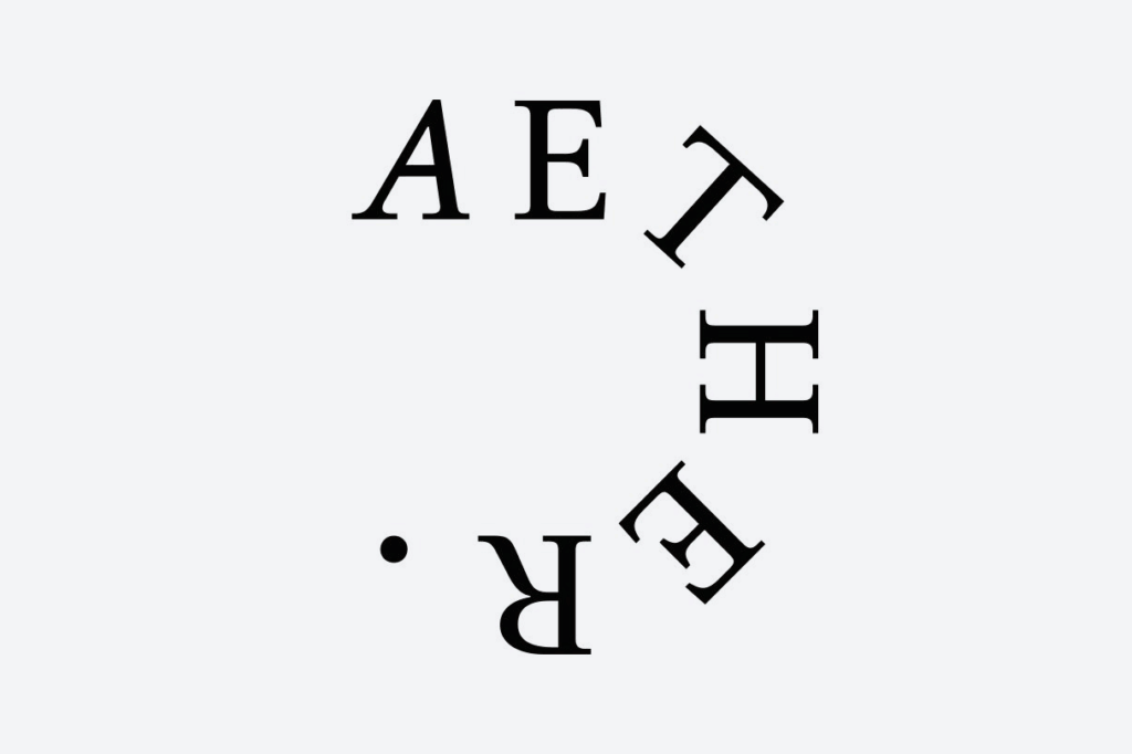
The logo’s lettering grew from my interest in the softness of Japanese calligraphy. Its fine serifs reminded me of the incense sticks themselves, while the looping shapes suggested smoke curling upwards. Finding a balance between those straight lines and rounded curves took some exploring. I liked the sense of the lettering coming back to itself. It connected with what interested me about the ritual in the first place: taking a moment to become more centred in yourself. I hoped that moment could begin before the incense was even lit.


