← Work

Piola Pastificio

Piola Pastificio was just around the corner from our office, in a tiny space that used to be a fish shop. Working with Antonio and Johanne, the couple behind Piola, we quickly felt part of their family business. There was this feeling of being invited to a big Italian dinner, with time to talk, drink good wine and finish with a strong espresso. We wanted to carry that warmth into the identity. We kept thinking about the little cafés in Italy, where the lettering feels made by someone who works there, and different typefaces come together in ways you would never have guessed.

Made together with Sebastian Ygge

Overlapping Piola menus featuring red, green and blue lettering, flowing scripts and loose crayon drawings.
Inspired by old wine labels, we kept a simple layout and left room for a different drawing, image or piece of lettering each time.

The idea for the menus came from old wine labels we spotted in the basement toilet at Bar'Vin: a simple frame, with a different artwork inside each time. It gave us a way to make each Piola menu its own piece, changing almost weekly at the beginning. We loved the quick crayon drawings on the wine menus. They felt like the end of a long dinner—a little wine spilled on the tablecloth, but that’s okay. Looking back, we’re proud of how much room the identity leaves for food, art and everything Antonio and Johannes put into the place. Simple, but with a lot of emotion. For us, it comes back to that feeling of being invited in: sitting around a table, being in the moment and feeling the warmth of the people around you.

Black Piola Pastificio lettering above a wooden menu case on the restaurant’s pale exterior wall.
Yellow opening hours and a small outlined symbol on Piola’s glass door, reflecting outdoor tables and the street.
We kept the name simple, leaving room for the menus to take center stage.
Metal bowls, pans and utensils arranged along a stainless-steel kitchen worktop beneath wooden shelves.
Two glasses of red wine beside a wooden drying tray filled with small pieces of handmade pasta.
Overlapping Piola menus combining flowing scripts, bold rounded lettering and condensed type in black on white paper.
We loved how different typefaces came together in small Italian cafés. Here, flowing scripts sit alongside typefaces we found fascinating on the side of a parmigiano cheese.
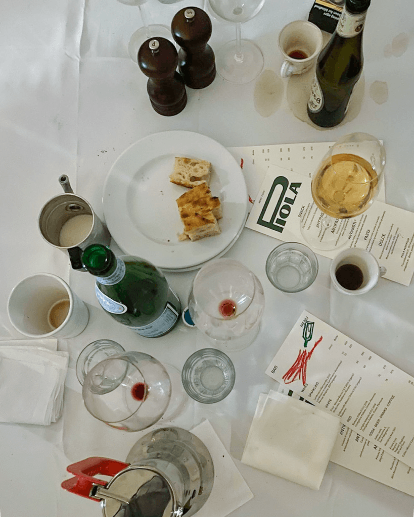
Piola menus among wine glasses, espresso cups, bottles and bread on a white tablecloth marked with spills.
The feeling we kept coming back to: a long dinner, good wine and time to enjoy the people around you.
A wooden crate of fresh green vegetables resting on a chair inside the restaurant.
Clams in their shells with green herbs and sauce in a metal cooking pan.
What was in season helped decide what went on the menu. At the beginning, it changed almost every week, giving us another chance to try something new.
Antonio preparing lunch for one of our meetings.
A narrow Piola wine menu with an abstract red and green crayon drawing above a neatly arranged list of drinks.
One of our favourites. A quick crayon drawing, loose and expressive, carrying the feeling of a long dinner with a splash of wine on the white tablecloth.
Next projectTourell